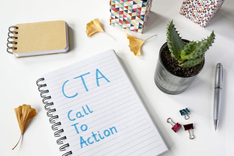
What is CTA? CTA (call to action) is an action we would like our users to perform. For instance, we would prefer the user to leave one’s email. With no CTA button, the landing pages are pointless.
Why Is CTA Buttons Necessary?
It is not correct to think CTA is required only for landing or order pages. For every page, its own CTA can be used instead of one general call to action. In one case, we offer sign up for a webinar, in another one we suggest registering at the website, sign up for email newsletters, or simply read the next article. In other words, we need to push the website guests or subscribers to do something more in addition to viewing the website and leaving the page.
Other possible use cases for CTA:
- Sign up for a newsletter;
- Make an appointment for a consultation;
- See the product;
- Download an e-book or a keynote;
- Register for a webinar;
- Take advantage of a special offer.
It is high time to check whether your page or emails have CTA buttons.
What is wrong with CTA?
Let us suppose we have already got CTA, but this button does not work as we expect it to. Some people hit it, others leave the page right away. Why is it so? In most cases, the reason is one of the following issues. Firstly, the CTA button is not noticeable. Secondly, it irritates users. Finally, you failed to persuade a visitor.
Issue 1. When can a user fail to find CTA?
The CTA button is simply not noticeable.
Probably, you have chosen the wrong background or placed CTA next to a picture of a half naked lady. In this case, it’s no wonder nobody pays attention to your call to action.
Solution: think about using another color for CTA, remove unnecessary text surrounding the button, work on the font size as it is highly important here. Change the button’s position relative to other elements of the page, especially in case photos or images.
Try to bind the picture to your call to action to attract the attention of the users to the button. For example, if you demonstrate a person with its mouth half open let it look in the direction of CTA.
One page contains too many CTAs or you offer several very similar options. In the first case, you distract users, while in the second one you make this mission impossible to complete as it is always hard to choose when having too many variants.
Solution: leave only a couple of straight calls to action that will deal with completely different things.
The CTA button is at the bottom of the page. Users should not be looking through the whole page to find a for signing up to a webinar.
👉 Solution: put your CTA button in the center and the eye level. You can provide more information about your offer under the CTA button, and repeat your CTA once again.

Issue 2. When does CTA irritate users?
The CTA button either lies or does not work
It often happens that we press some ad but nothing happens next. Broken and poorly selected links are most probably the worst thing for CTA. E.g. by pressing Sign up for the webinar, but we get to the page telling us about the presenter. Or, we click on Read more but are taken to the main page or, what is even worse, to the purchase page. As a result, we get frustrated and nervous users.
👉 Solution: just check everything. Check every single link whether it leads to the proper page, whether it is seen on that background, and what it looks like on different devices.
CTA is located in a pop-up window that appears right at the wrong moment and in the inappropriate place
Have you ever found yourself in a situation where you have arrived at someone’s blog and in an eye blink you see a window with an invitation to subscribe? I don’t know whether you like such an approach but personally, I am very irritated by this. In fact, I have not been able to at least read anything there, why would I agree to an invitation to subscribe for the newsletter, even though it is a polite one?
Here is another variant. You are offered a book with a huge discount, but you have not had a single look at the page with the literature. Not too many people like buying a pig in a poke even for little money.
👉 Solution: proper timing should be chosen for CTA.
You manipulate users
Of course, every button should be persuading performing something. But let’s agree not to use that frantically. What do I mean by this? There are numerous pieces of advice regarding how to force a user click on a link or a button:
- Offer limited time offers;
- Show that a webinar has got practically no free places;
- Underline how quickly the products are sold;
- Demonstrate the number of people currently considering this offer.
When you use these methods from time to time, there is nothing bad with them. Yet, when a user is constantly facing such offers, it can work against you.
👉 Solution: try convincing people your offer is better but not simply a limited time one. Write how much information is required to register or read the information, how quickly users can achieve the desired results. When will your answer the question. When a client is going to get one’s order. What bonus can be obtained for a fast purchase. What the guarantees are.
Issue 3. Weak CTA
Users do not know what happens after they press the button.
👉 Solution: adding a bit more details to CTA.
- Buy now → Buy your ticket now and save 20%
- Get → Get free access to …
- Download → Submit your email and get the book for free
- Register → Register for every button webinar
- Sign up → Sign up for our channel and read one piece of advice daily

Your offer is not interesting. Sure, this sounds not really pleasant, but it does not necessarily mean it’s hopeless. Maybe, your potential clients are not able to find you.
👉 Solution: take care of promotion, set up your ads, and target the page to get only the target audience.
Checking how good your CTA is
Scrutinize every page and answer several questions.
- Does this page have CTA at all?
- What are your goals? What should your visitor do after viewing?
- Whom do you address? It could be worth adjusting the wording.
- Is CTA seen at first look?
- Is it easy to understand what to press to perform the target action?
- After pressing the button, are users taken to the proper page? Will they understand what is happening?
- Is CTA irritating?
- Is it clear what users sign up for by pressing the button?
- Do you want to press the CTA button at all? If not, why?
The good news is that you can always adjust your call to action. After some experimenting, you will have no difficulties understanding what’s working better for your clients, sure, if you monitor your CTR index. Quick prompt:

And the last one — check what happens after users perform the required action. All steps following it should be thought out.
An expert behind the simplified online meeting and webinar software platform, MyOwnConference. In today’s flexible work environment, Dan offers invaluable life hacks, in-depth reviews, and savvy tips for organizing, promoting, and excelling in virtual conferences and webinars.