
A call-to-action element is what turns a webinar from something people watch into something they act on, and the MyOwnConference webinar service builds them into the room itself.
Call-to-action buttons and banners
The call-to-action buttons put your offer on screen at the moment you choose, rather than in a follow-up email that lands after the room is empty and the attention has gone.
Sales buttons, i.e. Call-to-Action or CTA, are elements on the screen (a button, a banner or plain text) that prompt the viewer to do something specific, such as register, buy, or send you an application.
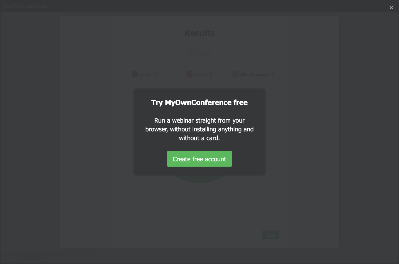
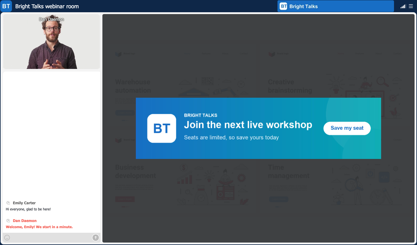
A CTA sits in one of three places in the webinar room, and that choice decides how much of the room it takes. "Fit to full screen" is the loudest of them, because it dims everything behind it and leaves your offer as the only active thing on screen.
"Overlap working area" puts it over your slide or video instead. The chat stays live beside it, so people can keep asking questions while the offer is up.
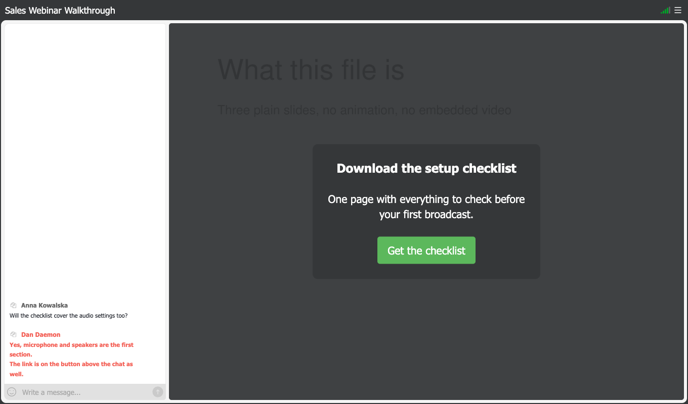
"Above the chat" is the quietest of the three, because your presentation stays fully visible and the offer waits in the corner until somebody is ready for it.
Elements in different positions can be on screen together, though that is rarely worth doing. The screenshot below has all three running, and the full-screen one dims the other two along with the rest of the room, so they are present but nobody can read them. Treat full screen as a position that replaces the other two rather than one that stacks with them.
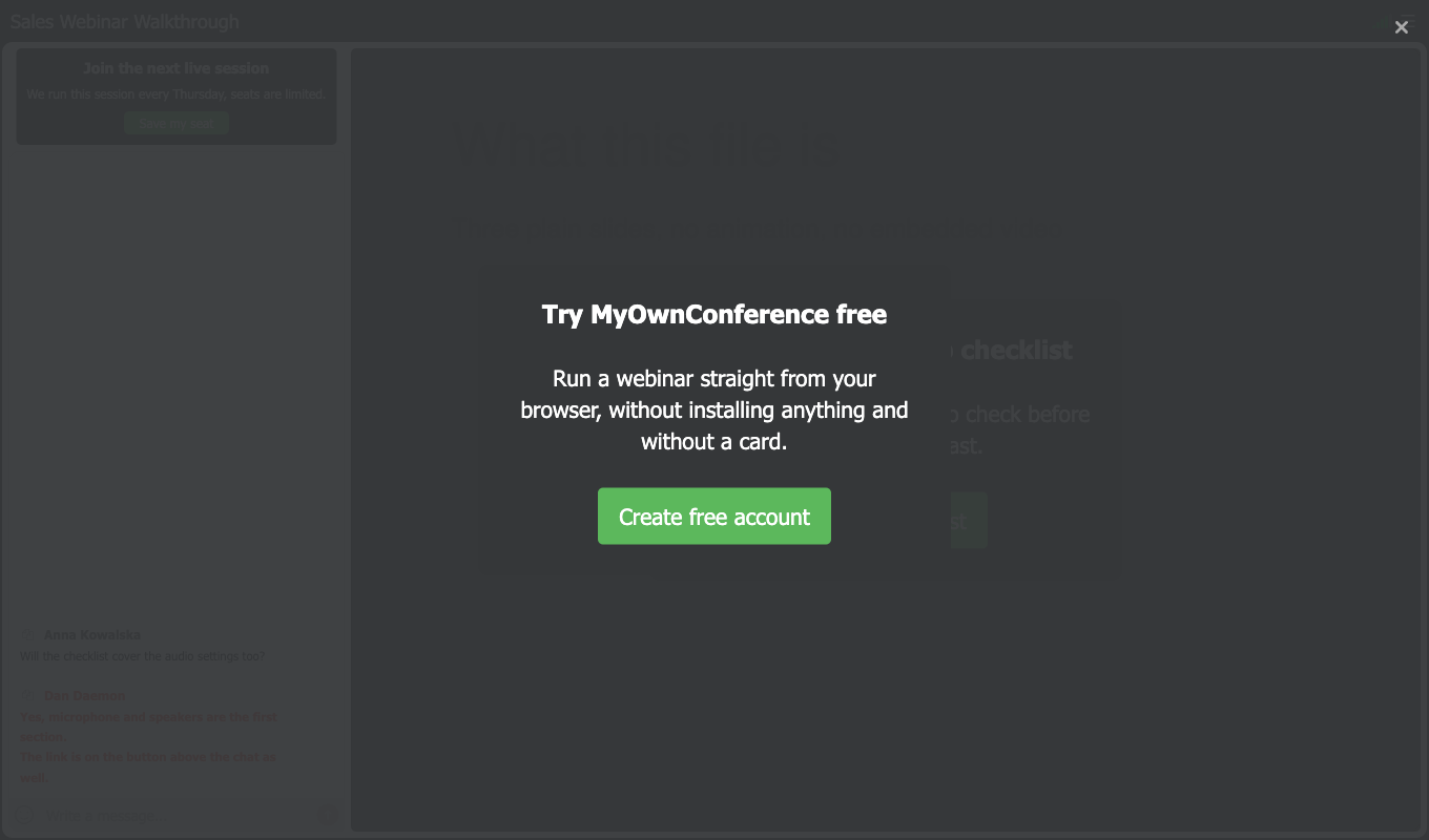
"Show" decides how long the element stays, either constantly or for a set number of minutes between one and twenty.
Banner images are accepted in JPG, PNG and GIF.
Why use call-to-action buttons at webinars?
CTA is worth using at webinars to:
- Attract the attention of attendees to your offer at some certain moment of the webinar;
- Induce users attending your webinar to perform one or several target actions. For instance, leaving an order, applying for a paid course, or subscribe for a newsletter to name a few;
- Turn a webinar that informs into one that also sells
How to use a CTA button
You build and fire CTAs from the "CTAs" tab of the materials panel inside your webinar room, so you can set one up and launch it mid-broadcast. Everything you have ever built also sits in the "CTA" tab of "Storage" in the control panel. If you want the click-by-click version rather than the strategy, CTA buttons in the help centre walks through the setup screen by screen.

Two formats are available, a text announcement and a banner.
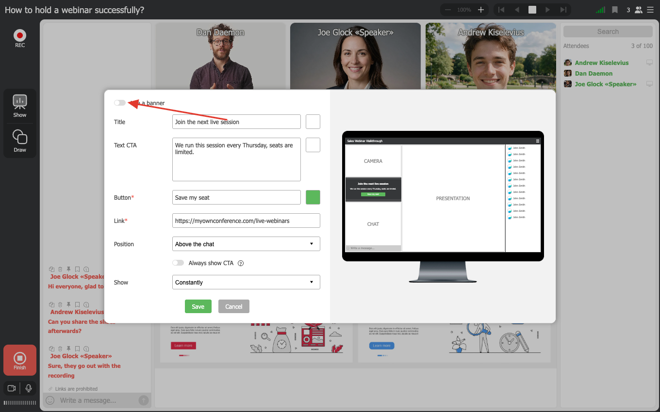
When working with the tool, the preview will be available in the right part of the screen.
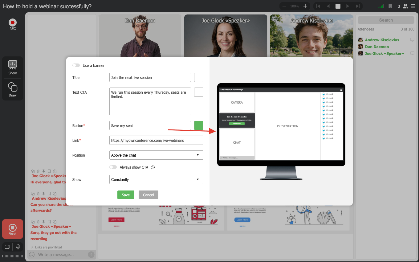
One setting is easy to miss. "Always show CTA" keeps the element on screen even after somebody has clicked it, which suits a banner you want standing all session and works against a full-screen offer you meant to show once.
If you prefer to make your offer even more noticeable, be sure to add a colorful banner to it.
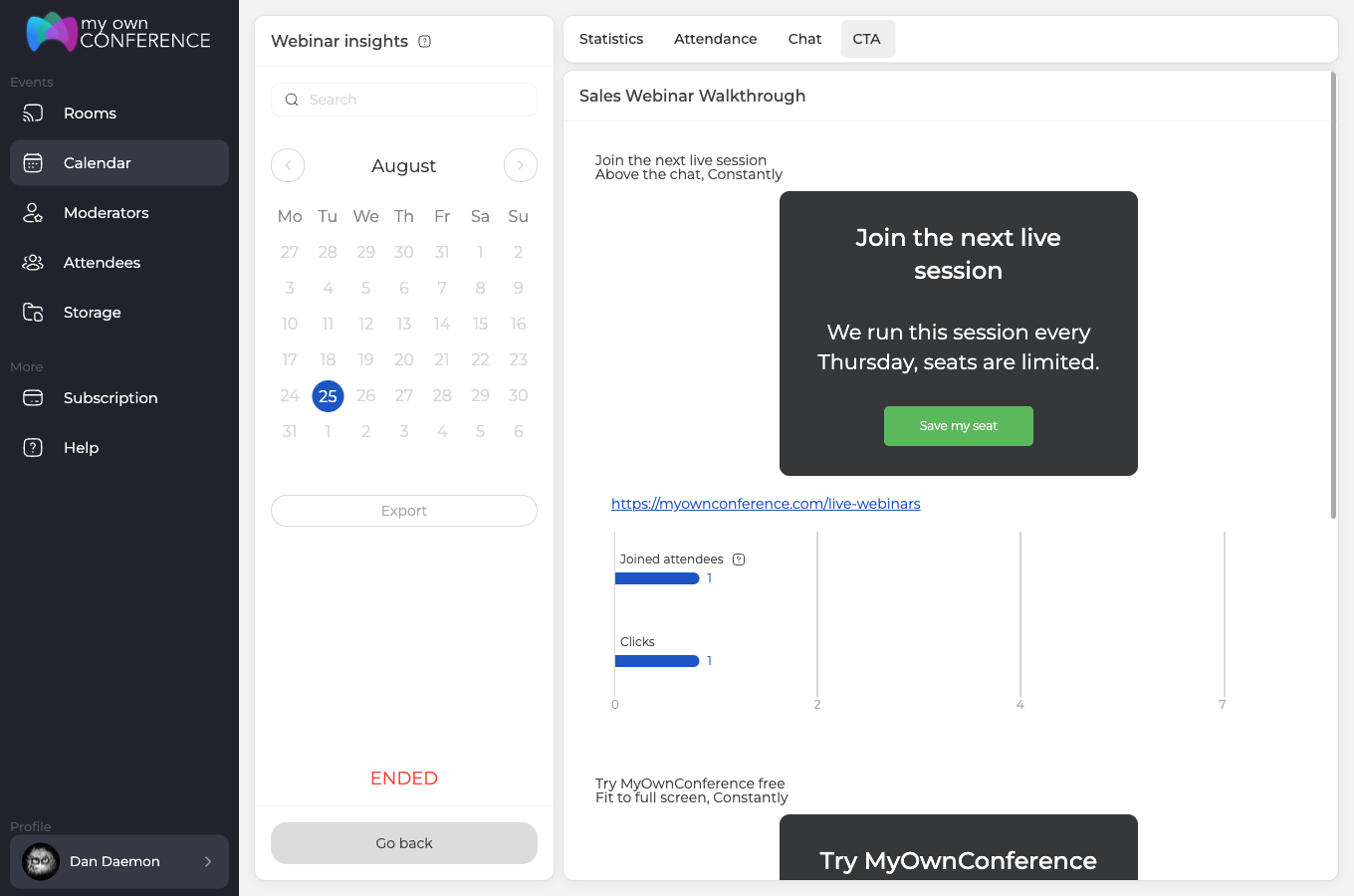
After the webinar the "CTA" tab of the "Webinar insights" report lists every element with two numbers, the attendees who saw it and the clicks it earned. Both numbers are clickable and open the list of people behind them, so you can see who followed the link and not only how many did.
See how CTAs in MyOwnConference work for the feature tour, or CTA buttons in the help centre for the click-by-click setup.
A worked example, from goal to result
Most advice about calls to action stops at "put a button on screen". What decides whether it earns anything is the handful of decisions you make before the event, so here is one offer carried through all of them.
Start with a goal narrow enough to count. Not "more sales", but one action a person can finish in the ten seconds your button is in front of them.
| What you decide | This example |
|---|---|
| The goal | One booking for next week’s demo |
| The position | Overlap working area |
| The button copy | Book the demo |
| The moment | Straight after the pricing slide |
| How long | Constantly, to the end |
| The tag | utm_content=cta-pricing |
Copy is where most offers lose people. "Book the demo" names the thing that happens next, while "Learn more" asks the reader to guess, and a button that has to be guessed at does not get pressed.
Timing is the decision people get wrong most often, because the instinct is to save the offer for the end. The end is where your audience is thinnest. Fire it straight after the part of your talk that earns it, which is usually the moment somebody first thinks that this would solve their problem.
The last row is what turns the whole thing from a guess into a measurement. CTA links pick up UTM tags automatically, so give each element its own and the numbers stay apart when you compare two wordings or two positions. UTM tags covers how the entry link and the exit page fit together.
Then run the same offer again with exactly one difference, and compare. Changing one thing per event is slower than changing everything at once, and it is the only version that tells you which change did the work.
Final thoughts on call-to-action
A call-to-action works when it arrives at the right moment, which is usually just after you have explained why the offer matters. Pick the position that suits the moment, choose between a banner and plain text, then read the click statistics afterwards and adjust the timing for next time. That is what turns a webinar from something people watch into something they act on.
FAQ
How do I choose the best moment to show a CTA during my webinar?
You should pick a moment when your audience is most engaged and interested in your offer. For example show the CTA after you’ve explained benefits, shared a story, or just before a break. Test different timings and see when clicks are highest.
How many CTAs can I display simultaneously without annoying attendees?
Elements in different positions can share the screen, but the full-screen one dims everything behind it including the other two, so stacking it with them gains you nothing. One offer at a time is the version that works, and the decision worth making is which position suits the moment rather than how many you can fit.
Is it better to use a text announcement or a banner for CTA?
Use the format that fits your webinar style. A text announcement can feel less intrusive and more conversational while a banner draws more visual attention. You may start with text and then test a banner to see which yields better response.
How long should each CTA remain visible to get good engagement?
Constantly or a set number of minutes between one and twenty, which is the range the "Show" setting offers rather than a recommendation. A short window suits an offer tied to one part of your talk, while constantly suits a banner above the chat that nobody has to act on immediately.
How do I track how effective my CTA was after the webinar?
The "CTA" tab of the "Webinar insights" report gives you attendees reached and clicks earned for each element, and both numbers open the list of people behind them. Comparing two versions needs one more step, which is giving each its own UTM tag so the numbers stay apart.