Landing pages are a powerful tool in today’s digital marketing world. Businesses use them to strengthen their online presence.
Everything You Need To Know About Landing Pages
Summarize with
In this article, we will look at what a landing page is and why it is needed. Discover the power of sales pages for your marketing strategy. Learn why they’re essential and how to use them effectively for maximum results. We’ll even analyze a successful case study for real-world inspiration.
Overview
- Everything You Need To Know About Landing Pages
Definition of a landing page and its primary role
Landing pages convert visitors into customers. Their focused design encourages specific actions, like purchases or sign-ups.
Its uniqueness lies in its focus on one particular product or offer. Signup and registration pages drive action. They’re specifically designed to engage visitors and convince them to buy your product or service.
Why a landing page is so necessary?
It is necessary for several key reasons. Firstly, its clarity and precision in conveying information. This is critically important for successfully arousing interest and maintaining the attention of the existing target audience.
Landing pages give companies a powerful tool to present targeted offers to specific audiences. This focused approach dramatically increases the chances of converting visitors into buyers. As a result of this approach, we enhance the relevance and effectiveness of your advertising.
Beyond the advantages already listed, it’s also worth mentioning that a landing page, by its nature, provides very valuable analytics. Specifically, you receive information about visitor behavior, allowing businesses to improve and optimize their strategies continually. This directly impacts the well-being of the user experience.
What makes up a landing page?
Every detail on your registration page influences how your target audience engages and whether they take action. A landing page must be visually appealing and functional to ensure maximum effectiveness in achieving the set goals.
Headline
The first thing a visitor sees is the headline. Therefore, it should clearly and concisely convey the essence of your offer, attracting attention and engaging the audience.
Unique selling proposition
A well-formulated and understandable proposition that makes your product or service unique compared to competitors.
High-quality image and video
In simple terms, exemplary-level visual elements can complement the text and make the page more appealing.
Benefits and features
Focus on demonstrating how your product or service will solve your visitor’s problems and make their life better.
Feedback
Showcase real customer reviews on your landing page to build trust and drive conversions.
Call to action
A well-designed call to action (CTA) stands out with a clear button or form, encouraging users to take the desired action (purchase, subscribe, etc.).
Contact information
Boost trust and simplify customer interactions by making your contact information readily accessible.
Search engine optimization
Another crucial aspect is SEO optimization. This makes your landing page rank higher in search engines, increasing its visibility and attracting a wider audience of potential clients.
What industries can use landing pages?
Landing pages offer flexibility and versatility, making them valuable assets in diverse fields. As online presence becomes vital for success, these pages help businesses stand out and reach their goals. This proves especially relevant today, as establishing an online presence is crucial for the success of any new project. Let’s discuss in more detail how exactly such pages can be used in different areas.
E-commerce
Landing pages play a key role in promoting products and services. They provide an opportunity for a more detailed and attractive product presentation, which helps increase sales and improve communication with new customers.
IT-industry
In the IT sector, these pages are used for promoting software and technological products. They provide the necessary information about the product and convenient methods for downloading or purchasing, which is an important aspect in attracting interested parties.
Healthcare
In healthcare, landing pages effectively present medical services and clinics, provide information about doctors and available treatment procedures. They can also serve as a tool to simplify the process of making appointments or online consultations, greatly improving interactions with patients.
Real estate
In real estate, landing pages can be used for visualizing and detailing real estate sale and rental offers. They can provide detailed descriptions, photographs, and contact information, which eases the process of searching and selecting properties for both buyers and renters.
Consulting
In consulting, they can be used to present various consulting services, showcasing unique expertise to people and offering individual solutions to problems in their field. They also provide contact information to facilitate communication between the expert and the client.
Education
In the educational sphere, they are ideal for registering for courses, seminars, and webinars. They offer detailed information about the programs and instructors available, helping to interest and attract future students.
Practical application of landing pages for webinars
Now that we’ve explored the different industries where landing pages can be used, let’s consider an example of their successful application based on webinars. This will allow us to see, through specific examples, how these pages can be effectively used to increase reach and audience engagement in the field of online education.
Promoting webinars with a landing page
In the process of organizing and promoting webinars, such pages play a very important role. They serve as the primary, and perhaps even the main, source of information where potential participants can learn all about upcoming online events. This includes not just general information such as the webinar topic, its exact time and date, but also provides complete details about the speakers and organizers, as well as the knowledge and skills that can be gained through participation.
Moreover, these pages usually feature a simple and understandable registration form, greatly simplifying the process of signing up for such events. Furthermore, this not only makes it easier to collect contact information for webinar organizers but also creates opportunities for conducting effective marketing campaigns in the future.
Equally important is the inclusion of a Frequently Asked Questions (FAQ) section, where explanations are provided for common participant queries. This helps to reduce the workload on organizers, offering visitors to the page some of the answers they are looking for in one place.
If the landing page is well-made and thoughtfully crafted with attention to detail, it not only significantly increases the likelihood of interesting and attracting more participants to the webinars but also expands the existing audience. Essentially, increasing the number of registrations and active participants is the main goal of any organizer of such events.
Landing page with MyOwnConference
Since we have already thoroughly explored the significance of landing pages in the realm of webinars, it’s time to move on to a more specific example of their use, particularly within our platform. Let’s discuss how to set it up and use it, specifically tailored to the needs of your users.
How to use the landing page mode
Firstly, you need to register and log into your personal account on MyOwnConference.
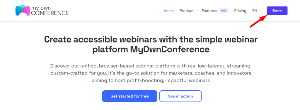
Then, proceed to the “Scheduled webinars” tab.
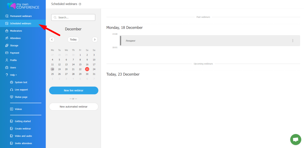
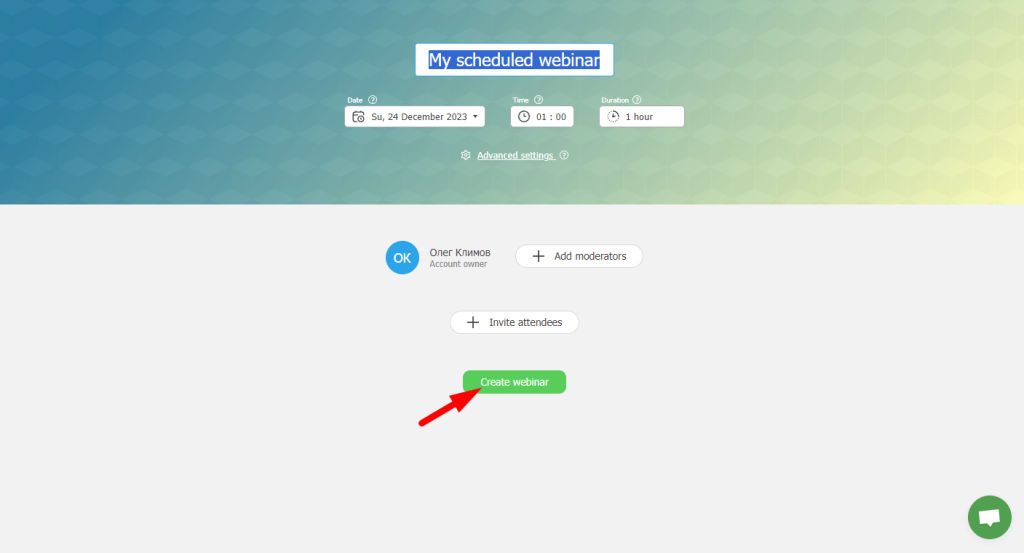
Click on “New live webinar”.
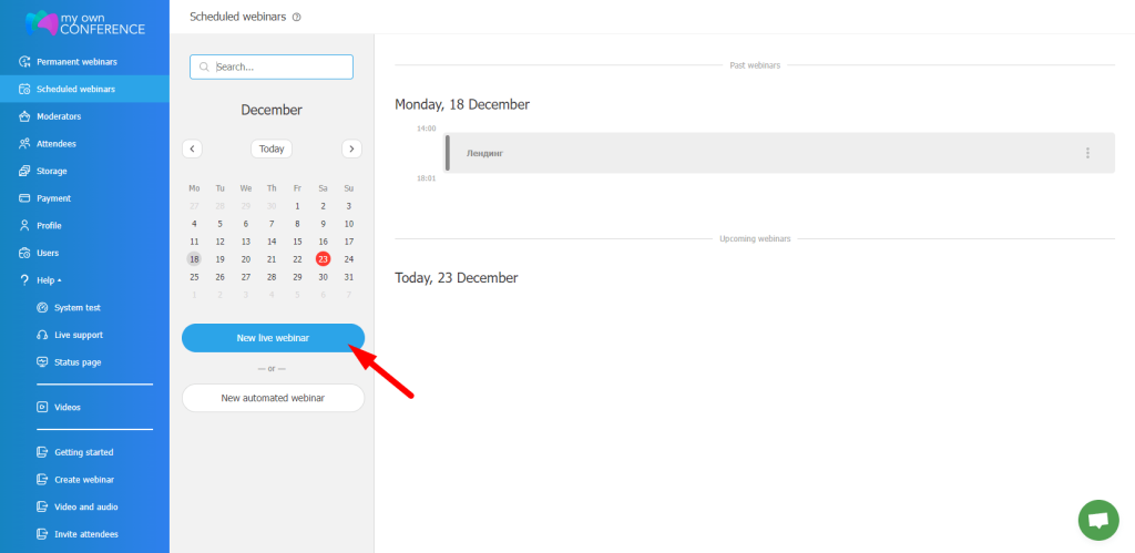
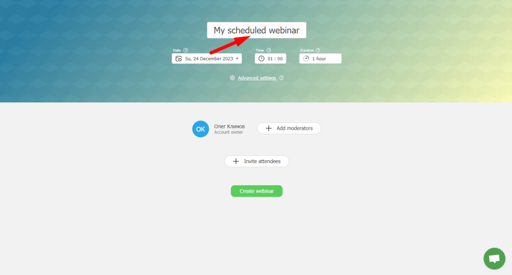
Enter the title.
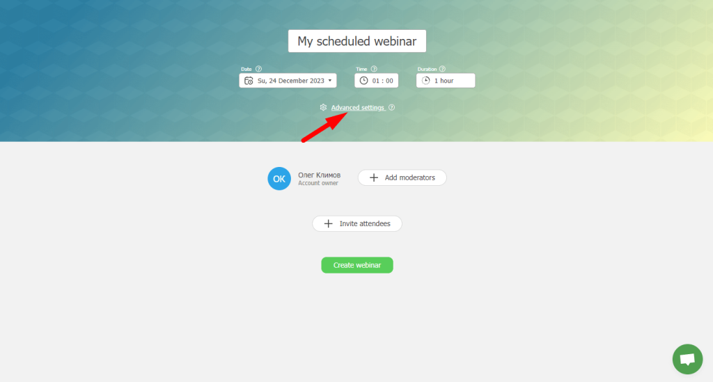
Next, go to “Advanced Settings”.
“Registration”.
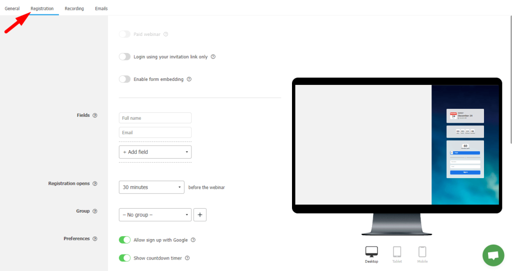
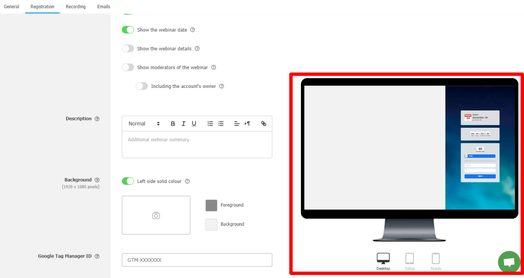
Here, we can see numerous settings.
Let’s go through each of them
“Paid webinar” — this feature allows you to restrict access to the webinar, making it paid for participants. However, to use this feature, you need to send a request to the payment page, in the “Paid Webinars” tab.
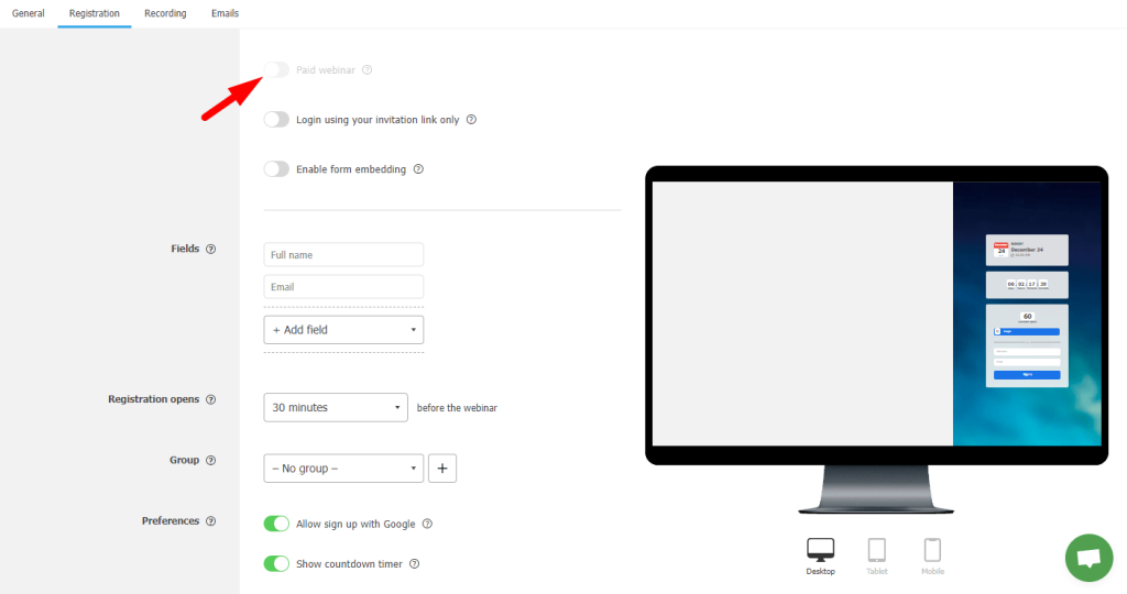
“Login using your invitation link only” — this option ensures access to the webinar only for those who received a personal invitation.
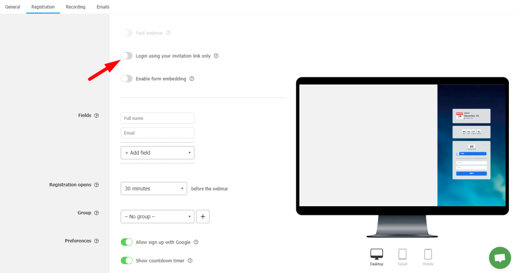
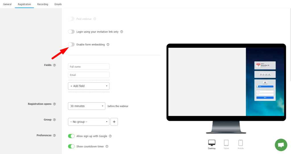
“Embed Form Embedding” — allows you to embed the webinar registration form on other websites.
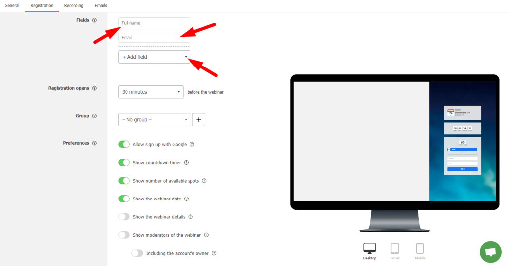
“Fields” — here, you can set up fields that participants need to fill out during registration, such as name, surname, email, etc.
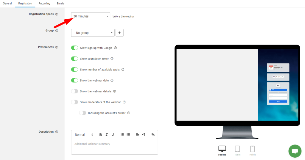
“Registration opens” — set the time before the webinar starts when participants can enter the room.
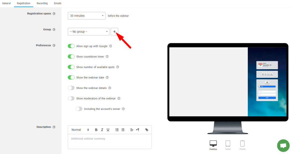
“Group” — you can determine which groups the registered participants will be added to. Add a group by clicking on the plus sign.
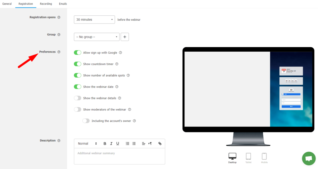
“Preferences” — this function allows you to customize the registration process and collect necessary information from participants.
Plus align the event more with your brand
- Allow registration through Google: Participants can use their Google account to register for the webinar. This makes the process faster and more convenient, as users don’t have to fill out additional registration forms and can sign in using familiar credentials.
- Countdown: Displays a timer counting down to the start of the webinar, raising anticipation and readiness among participants.
- Show the Number of Available Seats: Informs potential participants about the number of remaining seats, which can encourage them to register more quickly.
- Webinar Start Date: Provides information about the date and time of the webinar’s start directly on the entry page.
- Show Webinar Title: Displays the name of the event to clarify which webinar the user is registering for.
- Show Webinar Presenters: Provides information about the presenters, which can be an additional incentive for registration.
- Show Owner: Displays the organizer of the webinar, which can add trust and transparency to the event.
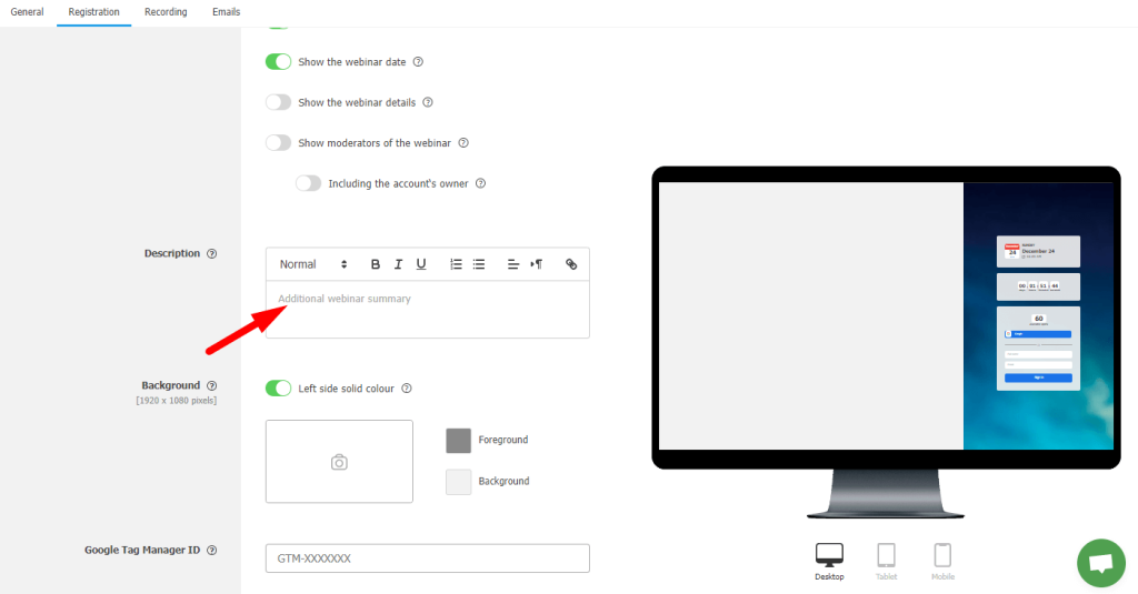
“Description” — additional information about the webinar that participants will see.
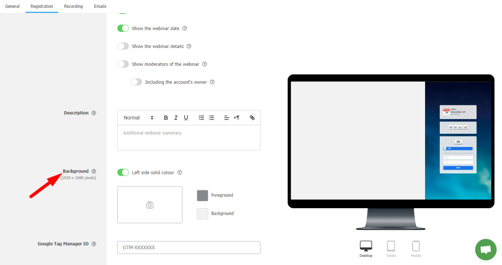
“Background” — choose the background color and text for the entry page.
“Google Tag Manager ID” — allows you to add a GTM identifier to track page visits.

You can see the results of your settings for different devices on the right.
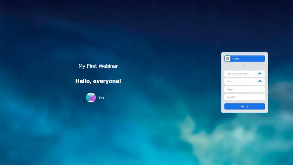
All done, your signup page is ready. Now you can copy the link in your personal account and send it to your social networks.
Here is an example of a webinar registration page created by the author of the article.
Advantage of a landing pages
If you are looking for a way to stand out from competitors and attract your audience’s attention, a custom-designed landing page can be a great help. Turning to professionals in this situation is the most appropriate choice. This solution ensures that you receive a page that not only meets all the standards but also accurately reflects the uniqueness of your brand.
Conclusion
Landing pages are an integral part of successful online development. They act as a business card for your business, and if you want to attract more attention online, creating an attractive and functional marketing page is essential.
The MyOwnConference webinar platform gives you the ability to organize online events comfortably and effectively. Thanks to flexible sales page settings, each webinar can be adapted to the unique needs of different fields of activity, from education to business, ensuring a high level of engagement and conversion.
FAQ
A landing page is a specially created web page, designed to effectively engage a visitor and inspire them to take a specific action, whether it be purchasing your product or service.
A landing page helps to purposefully attract attention to a specific offer or product, increasing the likelihood of converting visitors into customers.
The main elements of a landing page include a headline, unique selling proposition, high-quality images or videos, benefits and features of the product, customer testimonials, and a clear call to action.
Landing pages are applicable in many sectors, including e-commerce, IT, healthcare, real estate, consulting, and education.
A landing page can be used for registering and informing potential webinar participants, providing detailed information about the event and speakers, as well as collecting contact details for subsequent interaction.
An expert behind the simplified online meeting and webinar software platform, MyOwnConference. In today’s flexible work environment, Dan offers invaluable life hacks, in-depth reviews, and savvy tips for organizing, promoting, and excelling in virtual conferences and webinars.


