
A landing page is overlooked but a compelling method of boosting the number of leads and registrations. It’s a web page where users typically land after clicking on a particular ad or link, such as an ad for the upcoming webinar. It can contain the event’s title, its main benefits, information about the speakers, and, most importantly, a CTA (call-to-action) button.
Perfect Webinar Landing Page Examples You Need
Summarize with
Why do you need a landing page?
Numbers speak for themselves. According to research, companies that use more than 40 landing pages generate 120% more clients than the companies with less than 5 landing pages.
Your main goal is to make your potential customer willing to acquire what you’re offering. A landing page made perfectly — which means informative, aesthetic and exciting — will make it more likely that someone will sign up for your future events.
How to create a landing page? A lot of platforms offer their templates. It means that the only thing you have to do is to add the missing information. It’s undoubtedly an easy and quick way, but you must remember that the landing page won’t be unique. So, in the future, create your landing page customized to your own company and its design.
You don’t have to be a graphic designer. There are also creators of landing pages, so you can get a unique page. Some platforms offer creators, but there are also a lot of services that allow making a landing page by yourself.
The third option is to order a landing page. It all depends on your time, budget and goals.
Creating the landing page — necessary steps
Keep in mind that some steps guarantee your landing page success. Those are:
- Header. It’s a crucial step. It has to catch the eye and be impossible to ignore. You can achieve that by hurrying up the potential attendees; share fascinating facts; specify your target group.
- Content. Keep your content simple. People need to instantly understand what you’re offering and how to get it. Long blocks of text scare people away, so use only the essentials. The same goes for your signup form — if possible, just ask for an email address. Finally, make sure your landing page looks great on all browsers!
- Stick to a consistent, straightforward design. Chaos is your enemy — you need to look at the landing page and get it in 5 seconds. If you don’t, then you will know that the potential client won’t bother to understand.
In this article, we will look over many exciting landing pages and analyze their conversion potential and the areas of improvement.
Litmus Email Accessibility Webinar

Source: litmus.com
This landing page design is minimalist, professional and pleasant for the eye. The bold webinar title is very well visible and sets a clear objective.
Remember that it’s always a good idea to use such as «easy» and «simple» to get the viewer interested.
The potential participant knows from the start; there will be three steps. It sets an expectation for a specific webinar structure, meaning the hosts must live up to that expectation.
The copy is clearly written. The participant is to get both advice and research to support the advice.
The bullet points elaborate on the three steps mentioned in the headline, which makes the copy consistent and understandable.
Every point begins with a specific verb in bold: write, design, optimize. The viewer doesn’t even need to finish reading the sentence to understand what they will learn from the webinar. It’s a wise decision considering the ever-shrinking attention spans.
The presenter info is not distracting or overbearing: we only see their job titles. It is usually the right choice if the presenters do not have any overly impressive credentials to entire the viewers. Otherwise, it’s a lost opportunity.
The signup form looks like it asks for too much: the company name, work email, phone number — not everyone will be able to provide this info. However, it’s also an excellent way to narrow down your target audience.
The CTA button evokes an emotional response. «Save your seat» implies scarcity and brings more conversions than the ordinary «Register.»
SEMrush Old Content Webinar

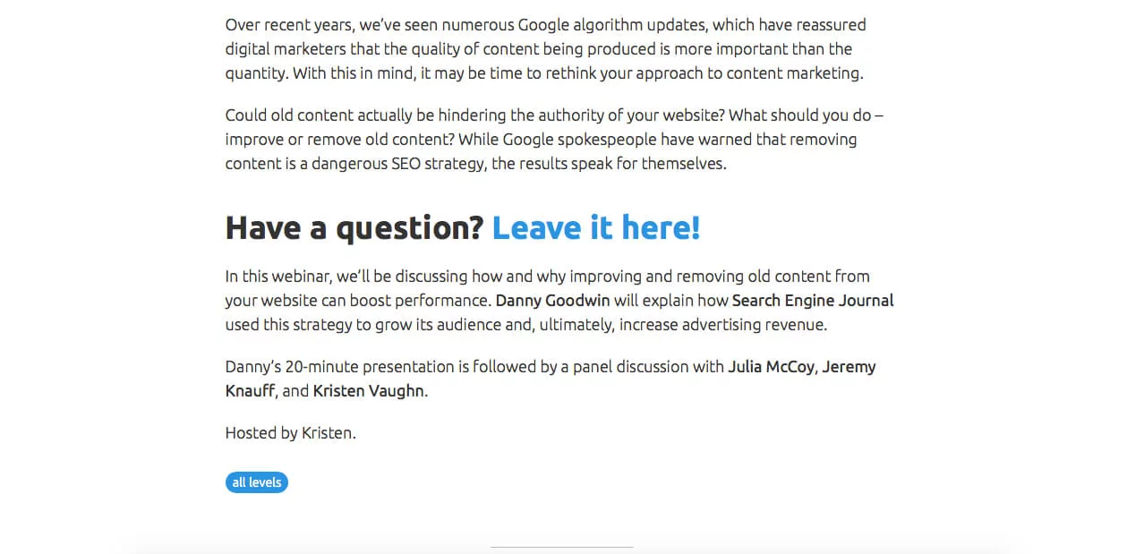

This webinar emphasizes its speakers since their photos immediately strike your eye. However, their credentials must be present, and you must click away to read their biographies. It needs to bode better for the conversion rate.
The same could be said about the unique feature of this landing page — the outbound link for users to ask questions. It could be an efficient way to collect feedback, but it can distract the potential viewers from completing their registration.
The copy is clear and engaging — the writer asks rhetorical questions to pick the participants’ curiosity. What content marketer wouldn’t appreciate a clear-cut strategy for dealing with the old content?
The webinar structure lays out in advance — a 20-minute presentation followed by a discussion. Viewers can plan their time accordingly. The «Register» button repeats twice, which is nifty since it is more likely to bring the user right to the primary goal. Despite the criticism, this webinar landing page entices the potential viewer with its clarity and simplicity.
Intercom Sales Through Live Chat Webinar
This landing page presents a recorded webinar. The webinar’s goal is expressed clearly in the headline. The registration form is much shorter than in the previous examples, which means more people are likely to complete it. It is also located at the top of the page, so it immediately catches people’s attention. The bullet list describes the benefits of the webinar in a concise (one sentence per point) and consistent (every point begins with a «how-to») manner. The paragraph right after the speakers’ photos emphasizes their credentials through numbers: they helped the company’s $50 million growth in ARR. It makes the speakers look much more credible and impressive. The significant disadvantage of this landing page is the overabundance of clickable items that can distract the user from the main goal: registration. On the whole, however, the landing page looks slick and professional.
HubSpot Successful Startup Webinar Landing Page

This webinar landing page mentions right in the headline that the HubSpot co-founders will be the speakers. It’s good marketing since these are some strong credentials.
It’s worth noting that the registration form does not require much information from the viewer, so a high conversion rate is expected.
HubSpot includes a link to its privacy policy, which should reassure participants that their data is safe.
Overall, this webinar landing page is geared towards speakers’ credentials rather than the content. There is no explanation as to what the participants will learn during the event. However, considering the credentials’ impressive, that should not hinder the webinar’s success.
Sprout Social Webinar
This landing page is easy to read and digest. The paragraphs are short, and the bullet list clearly states the webinar’s benefits.
The signup form, although more detailed than for most webinars, does not require a phone number, so more people will be willing to register.
What is more, you can clearly see that the webinar is free, which is a significant selling point for many young professionals.
Salesforce CRM Adoption Webinar
Salesforce invites us to a webinar on CRM adoption. The title states the benefit clearly; however, 100% CRM adoption sounds a bit too good to be true.
Even though rhetorical questions are good at picking curiosity, they’ve gone overboard with those here. One or two would have sufficed; instead, they could’ve focused on making a small bullet list of the main perks.
The block paragraph at the end of the copy is huge and intimidating. It would have been better to split it in half.
The best part about this webinar landing page is the lack of clickable logos and links. You can only go to the privacy policy and terms from there. The fewer distractions there are, the more likely people will fill in the quite demanding signup form.
Red Hat Open Source Webinar
This webinar immediately caught our attention with its well-defined objective. Even those who know nothing about pharmaceutics would not be confused.
The date and time, including the time zone, are visible, which is quite helpful for busy folks.
The landing page design is nice and simplistic, with the CTA button being a cherry on top. The big red «Continue» is impossible to miss.
It would be better, however, if the paragraphs were not so long. They read well, but their sheer size could scare away the viewer. Incredibly intimidating is the biography of the first speaker.
The social network icons could also be pretty distracting. They are also located right on top of the page, which does not help the situation. In general, it is better to refer participants to your social media after the registration, possibly in a confirmation email.
AllenComm Get Smart Webinar
The good part about this webinar landing page is the CTA button, which stands out and has the brand’s orange color.
However, the webinar description is vague: it’s unclear what benefits the participants will derive from the event.
The speaker’s photo is also too big and distracting. The biography, although well-written, could do better with some more paragraphs.
SEO PowerSuite Webinar
Notice the unique feature of this landing page — the timer, showing how much time is left before the start of the webinar.
This marketing trick should produce a sense of urgency among potential viewers. It helps that all the company requires for registration is your email address.
However, because it’s so easy to register, there is a chance a lot of people will do so but never show up for the actual event.
The lack of webinar description also means that everyone will be coming with their expectations, which may not necessarily match the reality.
Microsoft Azure Webinar
It’s a perfect example of how being minimalist and concise is the best policy when creating a webinar landing page.
The headline lets the user know what to expect immediately. The bullet list clarifies it even further.
There is a filter for the target audience: only those with a Microsoft or GitHub account can join.
The «Submit» CTA button is in Microsoft’s traditional blue color. It is pretty noticeable against the white background.
Overall this webinar landing page has nothing extra, but it gets the job done.
Conclusion
Now that we’ve discussed the pros and cons of the best webinar landing pages on the market, it should be easier for you to create your own.
An expert behind the simplified online meeting and webinar software platform, MyOwnConference. In today’s flexible work environment, Dan offers invaluable life hacks, in-depth reviews, and savvy tips for organizing, promoting, and excelling in virtual conferences and webinars.


")


