Webinar advertising is a crucial step in capturing your target audience’s attention and setting the stage for a successful event. In this article, we’ll explore inspiring and effective webinar advertisement examples that can elevate your marketing efforts.
Webinar advertisement for leading brands and business campaigns
With the right strategies and tools, such as the robust webinar software platform MyOwnConference, you can design a campaign that resonates with your audience and drives attendance.
Advertisement for D-edge marketing campaigns
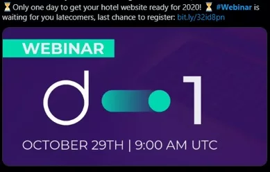
D-Edge effectively employs urgency to make their webinar ad stand out.
Urgency taps into the fear of missing out (FOMO), motivating potential participants to act quickly. However, it’s essential to strike a balance, as overuse might attract the wrong audience or cause skepticism. When done right, urgency is an excellent tool for converting undecided viewers.
D-Edge uses phrases like “only one day left” and “last chance to register,” paired with deadline reminders such as “2020 is just around the corner.” Additionally, the inclusion of hourglass emojis emphasizes the time-sensitive nature of the ad. This approach appeals to late registrants and ensures no opportunity is missed.
Webinar advertisement for Thales eSecurity campaigns
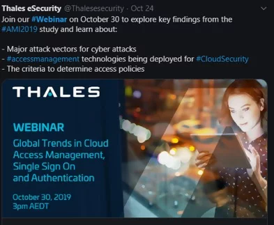
Thales eSecurity focuses on clarity and structure in their webinar advertising.
The use of a bullet point list to outline the webinar agenda makes the ad highly readable and engaging. Concise and direct, this format allows potential attendees to quickly assess the value of the webinar. Leading brands often use this approach to highlight key benefits and keep their audience focused. If you are choosing between dense paragraphs and a clear list, it is better to go with the list to enhance readability and engagement.
Advertising for ClearDegree campaign themes

ClearDegree takes a thematic approach by integrating Halloween into their webinar ad.
This creative and eye-catching strategy uses seasonal relevance to grab attention. However, thematic ads require a professional execution to avoid appearing overly casual. ClearDegree succeeds by pairing their Halloween theme with a well-crafted description that highlights the target audience and the primary benefit of the webinar. This business approach ensures the ad is both memorable and effective.
Advertising for Melyssa Griffin coaching sessions

This ad is remarkable for its concrete goal to get more traffic with Pinterest. That CTA is very on-point and easy to spot while scrolling on your device.
Melyssa Griffin’s webinar ad stands out for its precision and relatability.
The ad has a clear call to action (CTA) helping participants “get more traffic with Pinterest.” The casual yet professional tone appeals to a broad audience, emphasizing her expertise by mentioning past successes. Keywords such as “free” and “autopilot” further enhance the ad’s appeal, making it irresistible for those looking to achieve maximum results with minimal effort.
Advertisement for Better Place Forests educational events
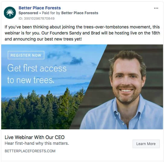
Better Place Forests creates an authentic connection with their audience.
The ad features a picture of the CEO, who also serves as one of the hosts, fostering trust and relatability. The blue and green color scheme aligns with the company’s mission, creating a cohesive and visually pleasing design. Personal touches like these add a layer of credibility, making the ad more effective.
Advertising for Heather MacFadyen parenting events
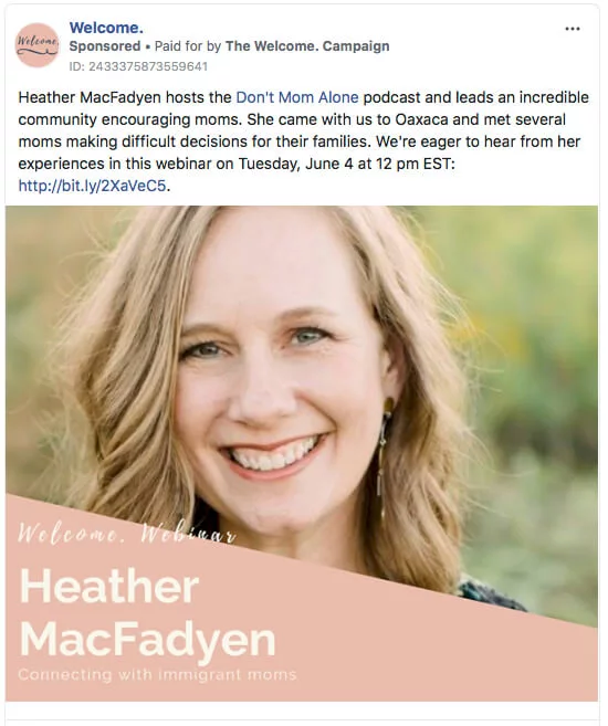
Heather MacFadyen’s webinar ad is a perfect example of targeted messaging.
Focusing on helping immigrant moms, the ad highlights her commitment by mentioning her trip to Oaxaca, showcasing dedication to the cause. The soft, peachy color scheme conveys positivity, while the host’s friendly demeanor enhances approachability. Crucial details such as time, date, and time zone are prominently displayed, eliminating the need for extra clicks to find essential information.
Advertisement for Bank of America merchant services
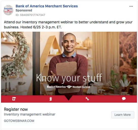
Bank of America Merchant Services opts for simplicity with their ad titled “Know your stuff.”
Featuring a young, smiling professional in a relatable environment, the ad communicates its message effortlessly. The inclusion of the company name and logo boosts credibility, while the minimalistic design ensures clarity. This approach appeals to professionals interested in inventory management, making registration an obvious choice.
Webinar advertising for Working Scholars online education

Bold and impactful, the Working Scholars webinar ad uses red and yellow to grab attention.
With a headline like “Attract and Retain Top Talent,” the message is direct and resonates with companies seeking actionable advice. The promise of low-cost college degrees for employees is compelling, and the no-frills description ensures the message remains powerful and to the point.
Advertising for SEMrush digital marketing sessions

SEMrush combines creativity and value in their webinar advertisement.
An astronaut floating near the red planet with a laptop showcasing the SEMrush logo is an inventive visual. Beyond the unique design, the ad clearly communicates the webinar’s value, ensuring it resonates with the target audience. This blend of originality and clarity makes the ad a standout example.
Advertising for InMoment customer experience sessions

Promising to reveal the secrets of quantifying the ROI of customer experience, the ad delivers a clear and compelling value proposition. The modern, fresh design uses ample white space and a contrasting title to draw attention. Such simplicity makes the ad appealing to its intended audience.
By analyzing these webinar advertisement examples and ideas, you can find inspiration to craft visually appealing and strategically effective campaigns. Whether through urgency, thematic creativity, or minimalist clarity, each approach offers valuable insights for your next marketing effort.
Smart tips for webinar promotion
To capture attention swiftly, incorporate urgency into your ad. Phrases like “Only one day left” or “Last chance to register,” combined with visual cues like hourglass emojis, can instill a sense of FOMO (fear of missing out). This strategy, effectively used by D-Edge, motivates potential attendees to act promptly without feeling overwhelmed.
Clarity is paramount. Using bullet points to outline the webinar agenda, as demonstrated by Thales eSecurity, allows readers to quickly grasp the value of the event. This structured approach highlights key benefits and keeps the audience focused.
Absolutely. Integrating seasonal themes, like ClearDegree’s Halloween-themed ad, can make your promotion more engaging and relatable. However, ensure the theme aligns with your brand and maintains professionalism to avoid appearing overly casual.
Personal touches can foster authenticity. For instance, Better Place Forests featured their CEO in the ad, creating a relatable connection with the audience. Including real people and aligning visuals with your brand’s mission can enhance credibility and trust.
An expert behind the simplified online meeting and webinar software platform, MyOwnConference. In today’s flexible work environment, Dan offers invaluable life hacks, in-depth reviews, and savvy tips for organizing, promoting, and excelling in virtual conferences and webinars.


