
How do you write and design a webinar invitation email to get those sweet conversions flowing?
Invitation emails
In this article we shall explore some of the prominent webinar invitation email examples and why they might be successful or not.
Best email invitation examples
Stanford webinar invitation email
First and foremost, it is worth noting that right in the title it is clear that the webinar is free. This creates a strong incentive to participate in it.
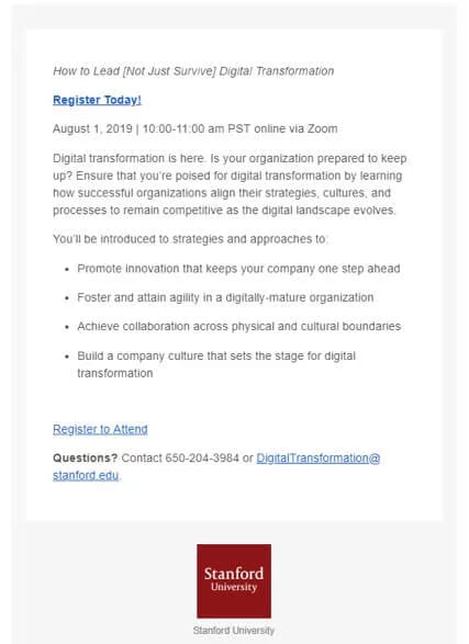
This email has a very simplistic and clear design. There is nothing flashy and distracting about it, which is fine since the logo speaks for itself.
The "Register" buttons are quite visible on the white background, and there are two of them, which is always a bonus. However, it would be nice if they could be a bit bigger than the rest of the text.
There is a bullet list stating what you will gain from the webinar. Although we definitely applaud structure and clarity, the overall descriptions seem pretty vague.
In general, this is a friendly and appealing free webinar invitation that is sure to entice many attendees with the name alone.
College admissions webinar invitation email
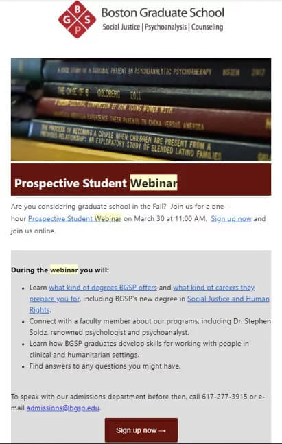
This webinar email invitation example is short and very clear. It tells you exactly what you will get from it, including information about degrees and career paths, meetings with faculty members, and answers to your questions.
The color scheme is consistent throughout: the burgundy header matches nicely with the signup button of the same shade.
The potential students can also clearly see other ways to connect with the university in case they can’t make it to the webinar. This is definitely a thoughtful gesture on the part of webinar creators.
Red cross webinar invitation email
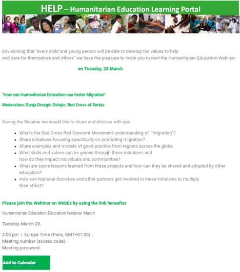
This invitation email example tries to tug at your heartstrings, which is fine since this is how NGOs attract volunteers and other interested parties.
You are provided a link to join the webinar and all the necessary codes and passwords. The "Add to Calendar" button is hard to miss, which adds a little convenience.
Interestingly, the bullet list is written as a series of questions, which makes people curious and encourages them to join the event. This approach can greatly increase attendance.
Energy management webinar invitation email
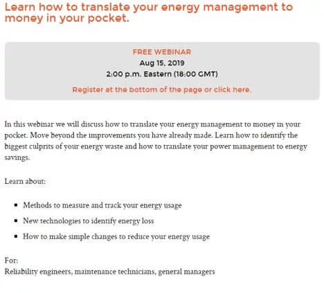
In front of you is a very minimalist webinar invitation email. However, it works, since it does not overburden the user with extra information and gets straight to the point.
The phrase "Free Webinar" is almost impossible to miss.
There are two CTA elements, colored in orange. They stand out nicely against the white and gray background.
The best part of this webinar invitation email is how clear the copy is. People would know what they are getting out of it after the first brief glance, so they are more likely to register straight away.
Web design webinar invitation email
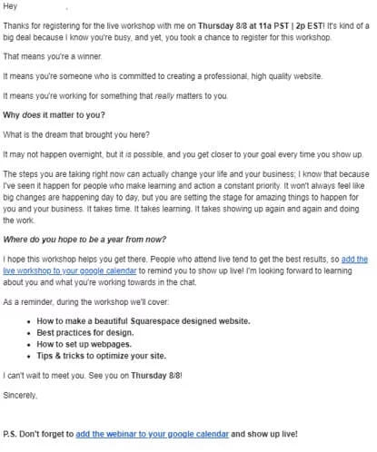
This webinar invitation email sample is highly inspirational. The webinar creator makes you feel like by visiting their webinar you will be doing something important with your life and actually reaching your goals.
It also lays the groundwork for mutual respect, since the host acknowledges how busy you are and how grateful they are for your interest.
Overall the email reads easily and inspires the viewer to show up for the webinar. Although it has no custom design, the bold and italic type steers the reader to the parts that matter.
Deeper learning webinar invitation email
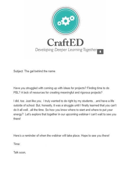
The author of this invitation email tries to connect with a viewer on a more personal level. They try to relate to the viewer, saying they were just like them at some point.
The rhetorical questions at the start work well too, since the reader answers them in their head and realize the importance of the upcoming webinar.
Key takeaways on webinar invitation email examples
Creating a friendly and engaging webinar invitation email is easy. Here are some key rules to follow:
- Do not use complex words and syntactic structures. Keep your copy simple and straight to the point. Use bullet lists for better structure.
- Make sure the registration button stands out. Make it bigger and of a different, bold color.
- If the webinar is free, let the user know in the email subject line. This should increase your open rate dramatically.
By following these simple tips, you will find it easier to write invitation emails that bring in registrations rather than shrugs.
FAQ
What makes a webinar invitation email friendly and effective?
A friendly and effective webinar invitation email uses simple, clear language, avoids complex words and sentences, and is straight to the point. The design should make the registration button stand out, and if the webinar is free that should be stated early.
Why is it important to mention that the webinar is free in the subject line or early in the email?
Mentioning that the webinar is free creates a strong incentive for potential attendees by immediately signalling value and lowering barriers to join.
What design and structure elements help increase registrations from an invitation email?
A simple and well-organized design makes everything clear. Large and noticeable "Register" buttons make it easy to sign up. A short list that shows what attendees will gain helps people see the benefits. Focusing on what users receive increases the chance that they will register.
How should the copy or message in the invitation email be written for best results?
The copy should be simple and to the point, avoiding complex syntactic structures and jargon; it should clearly articulate what the webinar will deliver and why the reader should care.
What is the benefit of framing parts of the invitation email as questions to the reader?
Using rhetorical questions helps engage the reader’s mind by prompting them to answer internally and recognise how the webinar relates to them, which can boost interest and attendance.